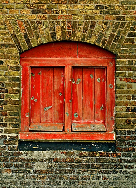
Window, part 1. I'm mostly including this as an example of crappy lighting and colour (this, by the way, is cranked right up from the original from the camera). Want to see it done much better? Go to the next picture.
Next picture: Window, revisited
Previous: White black and yellow
(from the gallery Man-made)